Damien Davis
Branding, Packaging
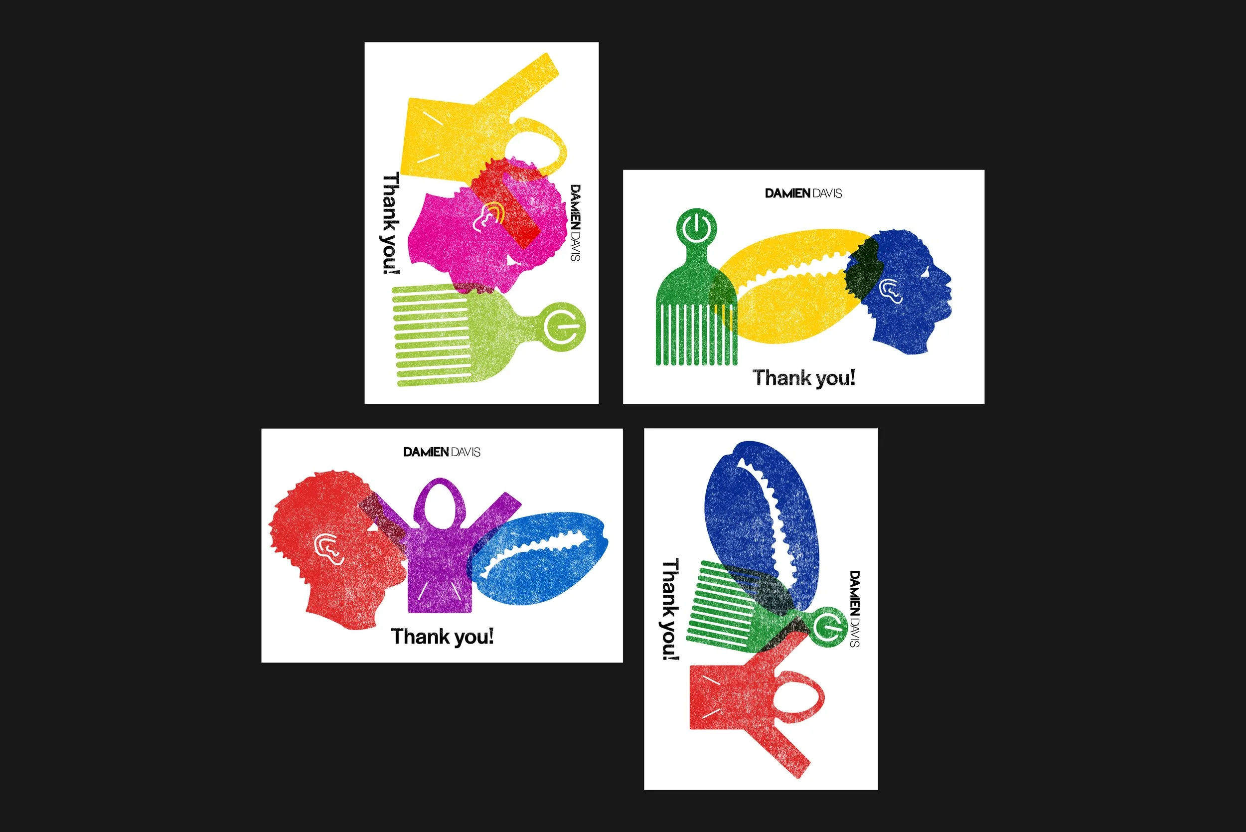
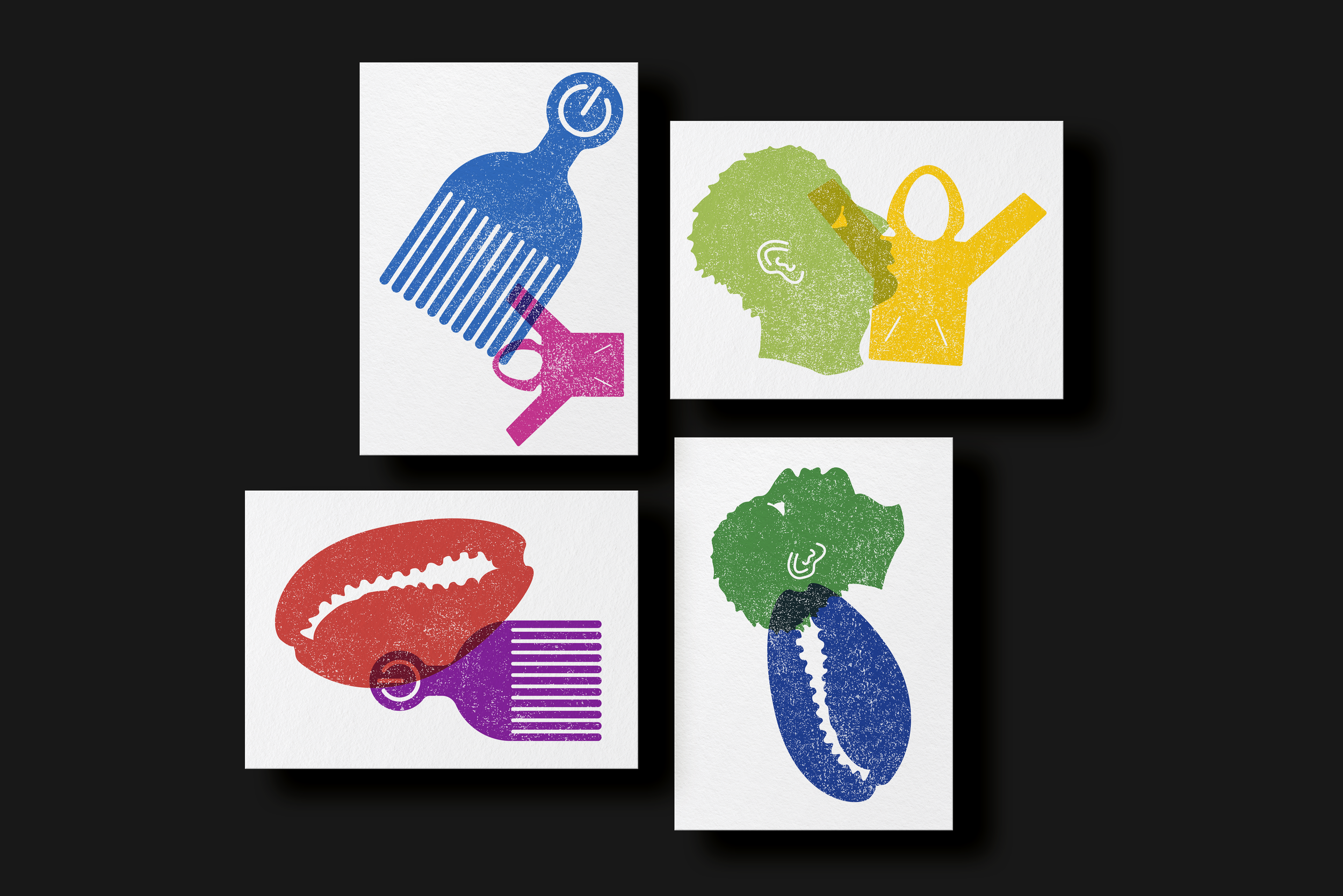
For the artist Damien Davis, I redesigned his logo and developed a versatile stamp system for his brand extensions and stationery. The stamp system was designed to allow Davis flexibility in experimenting with various colors and sizes, creating a playful yet cohesive aesthetic. The icons featured in the stamps are recurring motifs in Davis’s work, and the color palette was drawn directly from his artwork. The goal was to create a simple, adaptable brand identity highlighting Davis’s practice and providing space for his creativity and personal expression.